Let’s explore why the creatives, strategists and businesses make a clear, decision to do this.
To be clear I’m not here to take sides or poke holes in creative work (largely as we all know, that all projects and briefs are different, and I’m probably in a few glass houses myself). But I wanted to share some thinking I’ve been having on this fascinating topic.
When anyone mentions rebranding, it’s normally with a sharp intake of breath, and goes into the ‘too hard’ basket till next year. But businesses never stand still, so their brand needs to adapt with it. Market conditions, competitors, ROI, mergers, acquisitions and new digital platforms all play a huge part in why companies rebrand. Before any work commences, the strategic and business reasoning needs to be clear and defined.
Let’s explore the heritage camp first.
The Co-op and NatWest are two recent examples. Both, looking to the heritage and the past to build a new direction. But why was this chosen? I’m betting there were some fascinating ideas on the cutting room floor, for each of these projects.
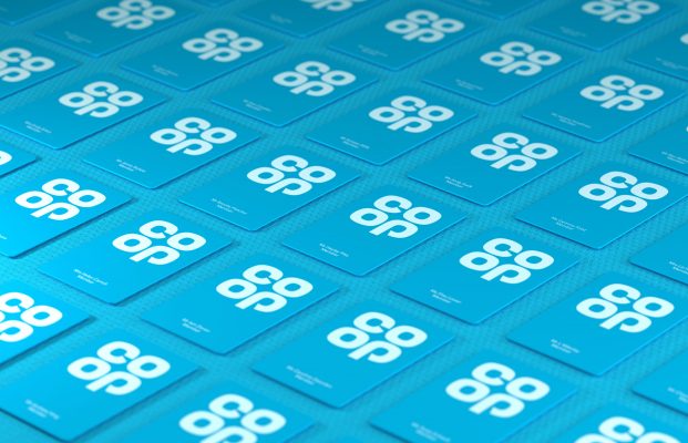
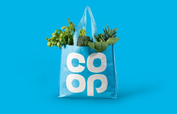
The Co-op returned to its clover leaf logo, originally designed in 1968, as part of its major rebrand. Ben Terrett, Co-op’s group design director, says the brand had become “confused and too corporate.” Which to be honest I agree with.
It’s this return to the familiar, the old roots which works for the generations. North’s refreshed brand works perfectly as a social icon, looks distinctive, iconic and modern in the new blue, but still keeps Mavis from No. 4 buying the milk she knows and loves.
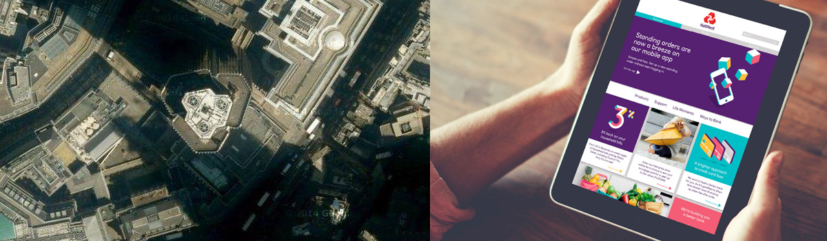
Natwest are no different. The bank returning to its original brand guidelines and symbol – a set of three interlocking cubes representing the original three banks coming together to form NatWest. Again recognisable, and refreshed. The cubes are the starting point for vibrant illustrations and bespoke typography by Futurebrand. As this is starting to roll-out, it feels modern, but has the essence of the past, and the recognisable colours really help this.
![]()
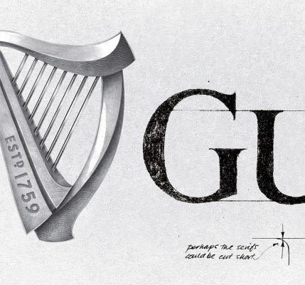
Lastly in a nod to the old, is everyone’s favourite Irish brand. First brewed in 1759 in Dublin, Ireland, Guinness is one of the most well-known beers in the world. To bring their vision to life, Design Bridge made models of their initial harp sketches with expert guidance from London-based harp-makers Niebisch & Tree. Design Bridge then sought renowned illustrator Gerry Barney, who had drawn a version of the harp in 1968, who hand drew the new one in 2016. The authenticity and provenance is vital to this story.
![]()
Design Bridge also collaborated with artisan letterpress print studio, New North Press, to help dramatise the harp’s form even further with embossing, foil blocking and metallic inks. The final design captures the depth, light and shadow of their sketch work, illustrations and the reality of a golden harp.
The craft, attention to the fine detail and beauty is there for all to see. It’s also said that the harp if made, would play in tune – that’s how detailed the identity is.
Now for the craft. The dreamers of something new.
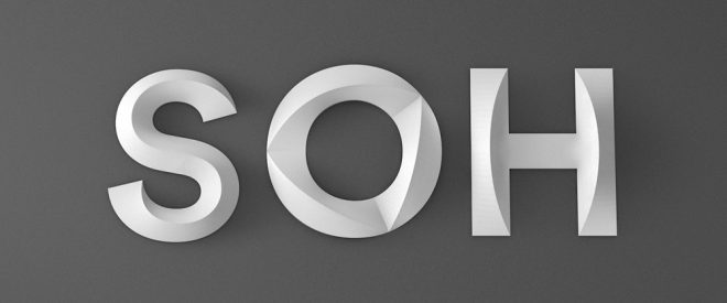
For an iconic building, you need an iconic identity. And for all you would-be-creatives out there, you can’t get anymore creative or iconic than the Sydney Opera House – even if it is Australian.
Designed in 1973 by Danish architect Jørn Utzon, it remains a classic of form and function and sits proudly alongside one of the world’s best harbours. Interbrand Sydney were tasked with a new visual identity – without touching the logo, sometimes a unenviable task. But they over-delivered. With their bespoke Utzon typeface and Shifting Perspectives brand idea and motion work, it is completely recognisable even from a simple single letter. It’s bold, crafted and a complete one-off.
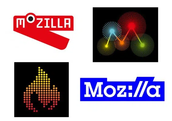
While we are on the subject of creative, I’m going to show a little man-love for Johnson Banks. Their approach and bravery to open-source the new Mozilla identity is nothing short of stunning. Their willingness to explore new directions, explain their thinking, take on board critique and feedback in an open forum needs commending and is a lesson to us all.
But what’s really great is it meets the needs of a digital-first client. Over and above the need for a PR angle for the agency. I’m looking forward to seeing how the brand evolves further over the coming weeks.
So which camp are you in?
What we can see is there are many ways to rebrand and redefine a company. With heritage involved it gives the agency a rich tapestry to uncover, especially in industries such as FMCG and finance where hard earned trust is very important. Any good branding agency earns its fee by defining the ‘space’ for the brand to live in. Once you have that, the decision can be made to draw on the past, or go boldly into the future.
Lastly, the value of the Bootcamp
At Mr B & Friends we work collaboratively with clients in a series of Brand Bootcamps to ensure the business, product and culture is clear and the ‘appetite for change’ is there. It’s all about defining a clear market position and linking the internal culture to that vision.