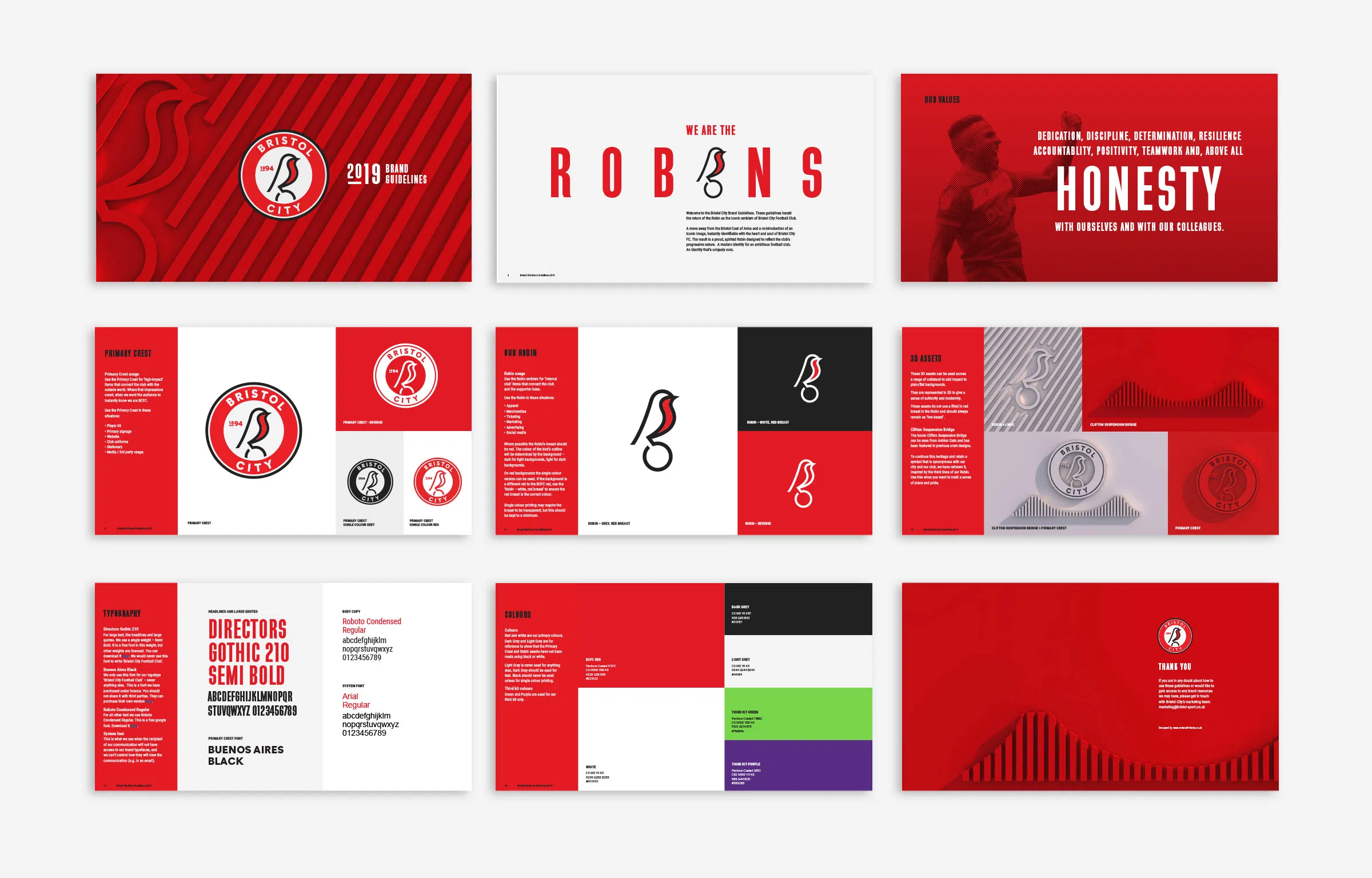
As a Championship club that’s upping its game.
Bristol City FC needed an identity to match its ambition.
Boasting a dynamic young manager, talented team, ambitious owner and an impressive newly revamped home stadium, Ashton Gate – Bristol City Football Club is becoming a force to be reckoned with.
After the success of our Bristol Bears rebrand in 2018, Bristol Sport asked us to help them establish an ownable and recognisable new identity for Bristol City Football Club. One that could reflect its progressive attitude and ambitious drive.
CREATE
A crest everyone can get behind
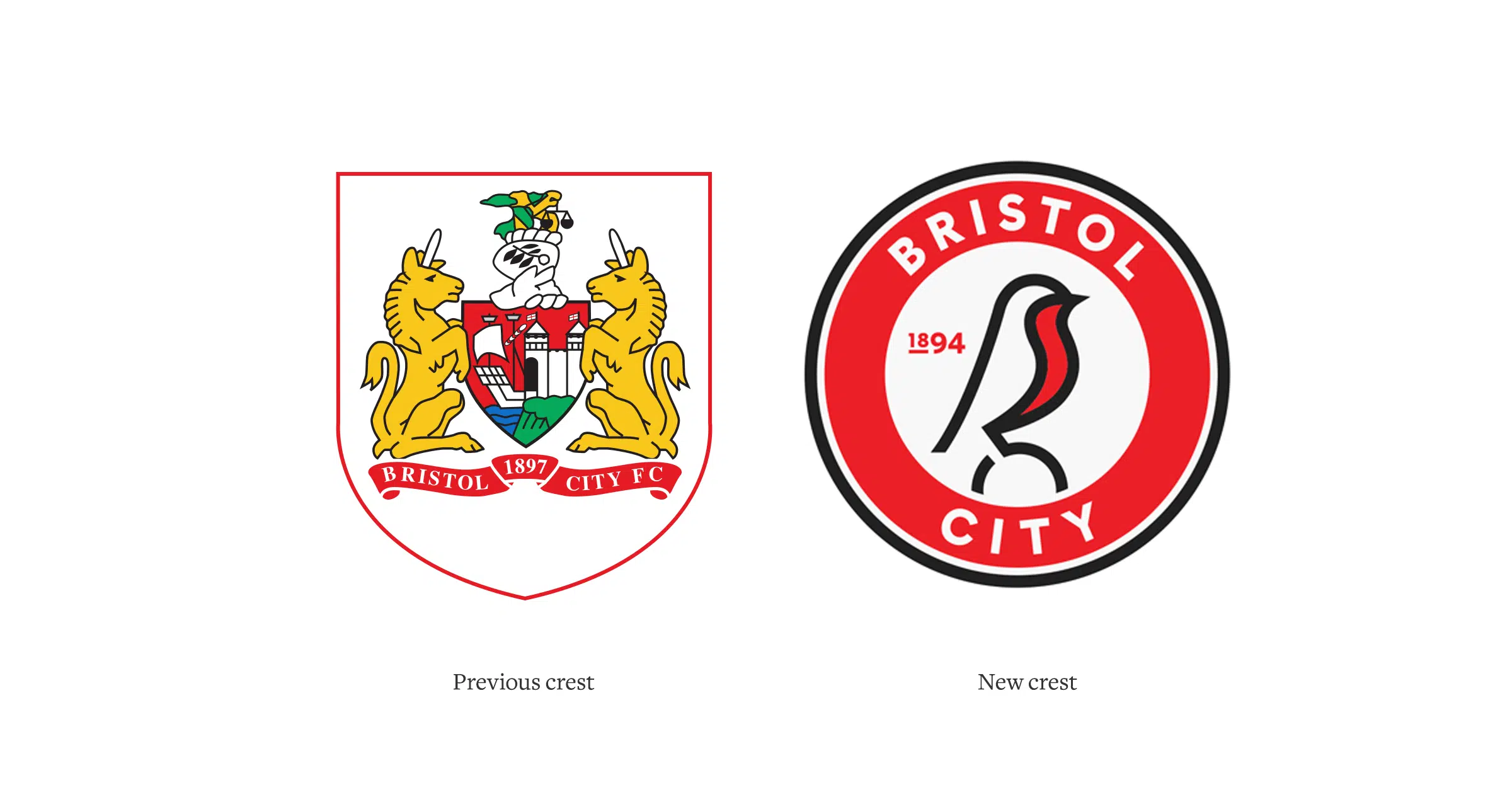
The club’s existing crest is an interpretation of Bristol’s coat of arms – which belongs to the city of Bristol, not Bristol City Football Club. To begin solving the club’s identity – or lack of one, we kicked things off with a round of interviews. Firstly, we grilled key members of the club, including CEO Mark Ashton, Deputy Chairman Jon Lansdown and Head Coach, Lee Johnson.
Next up, we ran two separate large-scale supporter surveys that went out to all season ticket holders and club members, as well as a focus group. From all the information we gathered, two key insights emerged:
1. Everybody loved the robin, and they want to see it make a comeback.
2. Fans want a more modern and progressive feel to the club crest; something they can own.
Return of the robin
Nicknamed ‘The Robins’, the feathery icon has long been a flight of fancy for the club. Intrinsically linked to the club’s rich history, it was time to make it land.
Inspired by the club’s Premier League ambitions, this robin needed to hold its own against some of the more famous marques that top the scoreboard.
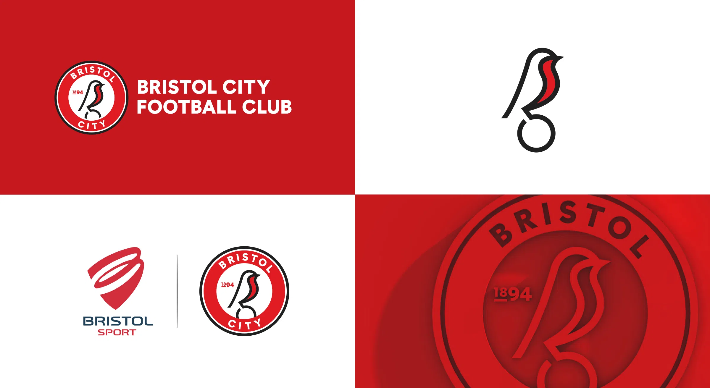
Once it had been established that the robin would take centre stage in the designs, the crest needed to be crafted to be bold and to give the bird the stature it needed to instil admiration. The graphic style emerged after exploring a range of routes with the client – from heritage to modern. Clean lines and a contemporary rounded font are offset by slightly softened secondary colours while the existing red remains loud and proud.
The robin itself had to be adaptable enough to work strongly on its own or as part of the crest, with consideration given to how to incorporate other important assets, such as Bristol’s famed suspension bridge into the supporting collateral.
The final concept of a simple, graphic robin perched on a football was chosen. Proud and iconic, the new crest brings a renewed sense of identity.
The crest was launched with a reveal at a key supporters pub, projections of the robin on Bristol landmarks and an array of outdoor hoardings throughout the city.
Our new crest features a contemporary take on Bristol City’s iconic robin, which has been part of the club’s identity, on and off, since 1949.
