As a design agency we need to mirror our inclusion goals through our craft, and ask ourselves how often do we challenge gender stereotypes when designing? Do the design ‘rules’ we follow simply hero the stereotypes we aim to defy in our values as a company?
From day dot it was apparent to me that Mr B & Friend’s weren’t just a design agency churning out work, but individuals, friends, who together wanted to use design as an agent of positive change and challenge industry ‘standards’ – I wanted to be a part of that. Eight months on, and an official member of the team, I’m still impressed by the efforts that Mr B’s proactively makes towards diversifying the industry and making it more accessible. Mr B-ers are dream-ers but more importantly, we are do-ers. Having a growth mindset and an open-minded attitude stands us in good stead to challenge a design system that is often overlooked, and rarely reconsidered – gender stereotypes look out.
The colour of gender
Born out of a cultural ideal of what it means to be a man or woman, designers have adopted a visual language for gender, whereby a system of colours, typefaces and shapes align with a male or female aesthetic. Colour being a main culprit. I’m going to take a stab in the dark and say you’re familiar with the cliché blue for boys and pink for girls… This is actually a relatively new concept established in the 1920s where the colour markers for gender reversed. Blue used to be a colour of delicacy and femininity, whereas pink was symbolic of strength and masculinity. If this proves anything it’s that the only thing that’s constant is change. We are living in a time of gender movement, whereby typical binary genders have become an outdated concept. People are breaking out of boxes, embracing their differences and celebrating their authentic selves. We need to create a space where they feel they belong.
I don’t think we need to necessarily tone down visuals or play it safe with designs, in order to stay inclusive. Muted colours and minimal aesthetics do seem to be a popular alternative in appealing to a diverse audience, but let’s not become fearful of colours and shun blues and pinks to avoid causing offence. We just need to be considerate in how we use them. Consider pairing a neutral palette with a customisable colour accent, where users have the choice of colour. This adds a sense of personalisation and individualism, whilst remaining uniform across genders. Or perhaps create a colour palette that mixes ‘feminine’ and ‘masculine’ colours together. You could even create a sense of balance and gender neutrality by using ‘feminine’ colours in darker shades, and ‘masculine’ colours in softer muted tones. Every colour is symbolic and has the ability to evoke certain feelings and moods, so think about what you are trying to say and which colour best represents this.
Use your voice
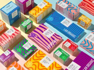
We can utilise more than just colour when it comes to avoiding gendered design. Toning down gendered messaging and cranking up the volume on USPs (brand story, employees, product functionality, materials, ingredients…) will not only increase customer engagement, but keep relevance and avoid public scrutiny. Take sanitary wear, traditionally they have been branded using feminine stereotypes, but let’s be real, no pastel shades or floral motifs will glamourise that time of the month. So why use them? In a sea of pink, TOMT sanitary products stand out – they have opted for bright vibrant colours and simple genderless patterns, they’re even eco-friendly – winning!
Thinx are another great example of empathising product functionality, omitting all the frills (literally) they revised their slogan: ‘For Women with Periods’, to ‘For People with Periods’ so that they didn’t alienate trans people. This shows the power of words. Language is ever-evolving and adapting alongside society, to meet the demands of modern life. Using inherently gendered terms can outcast people, nouns like ‘fireman’ and ‘mankind’, are part of an outdated patriarchal hierarchy and have since been replaced by neutral alternatives – ‘firefighter’ and ‘humankind’. Top tip: if you don’t know the gender of a group, air on the side of caution and opt for gender neutral terms.
Less obvious are the adjectives we use in addressing audiences to sell experiences and things, or in the way we convey the personality of a brand. Taking a sensitive and mindful approach to the tone of voice we use is key to reaching more people. This is also relevant when designing forms or personalised content. Are we broadening the gender options for people who live outside the binary gender markers? And is gender even relevant to the product/service? Let’s re-evaluate what is actually essential in data capturing, this will aid usability as well as upping inclusiveness. And let’s make sure we aren’t assuming pronouns (he/she/him/her) based on names. Mastercard’s TrueName campaign is a really tasteful example of how to do this well.
Your type?
It’s not just the words we use, but the way they look too. Does the typeface speak to the message you want to relay? Cursive, light, free-flowing typefaces are deemed feminine while chunky, geometric fonts are considered masculine. Just by using different weights from a single font family, designers can create the appearance of masculinity and femininity. By mixing and matching fonts we can blur the gender typical divide.
Even shapes and textures get casted as masculine or feminine. Rounded smooth shapes, curved lines and soft, fluffy textures are classed as ‘feminine’. Whereas strong, straight, sharp edged shapes and metallic, rough textures indicate a masculine tone. Why don’t we create a flexible system of shape, colour, pattern, that can resonate with individualism instead.
Now take a product that has a neutral function, (i.e. body wash) make it pink, add ‘for her’, sprinkle a little glitter for good measure, and whala, a product for women. Identical to the ‘male’ version but made gendered through marketing. Pink tax at its finest. You’ve been warned. Using stereotypes here creates short-cuts in thinking, making our purchasing decisions supposedly easier. This shows the capability and power of design and how ingrained within society this gender ‘rule book’ is.
Gender identifiers are everywhere. We are exposed to them from day one. The colour of your baby blanket, to the toys you played with, to the clothes you wear now… One of the biggest offenders being the retail industry. Retail stores have traditionally organised isles by gender using distinct colour schemes and signage. Online stores often mimic this, and categorise by gender instead of by product, causing discomfort navigating through the website, and posing a problem for people who want to shop across departments. This poor usability makes it difficult and time consuming for people to compare products. Not efficient and not inclusive from the get-go.
Branded from birth
In response to the culture shift, many toy stores have reacted by removing gender aisle markers and reorganising toys by age groups instead. Ridding children’s products of gender labels means that self identity would be free to evolve organically from the individual and not the culture. Children would play with toys that interest them and dress in ways that make them feel comfortable and confident.
However parents often have a big say and influence in these decisions, so first we need to educate older generations about non-binary genders. Gender stereotypes stem from the gender schemas we form as children, so without addressing how we depict men and women in society first, removing labels on dresses in an attempt to normalise boys wearing them, has the chance of resulting in bullying and discrimination. It’s a big ol’ mindset shift, and sadly the extent of our graphic powers don’t extend into the realm of magic, but we can control what we are presenting to the world and what we are choosing to normalise and give attention to. By creating ads that show a mix of genders playing with a toy and avoiding gendered terms and graphics, hopefully this will in turn give confidence and assurance to guardians in making future purchases.
Gender doesn’t just make us feel a certain way, it also contributes to us looking a certain way. Through cultural programming we are made to believe that there is a correct and ideal presentation of femininity and masculinity; which in turn plays a crucial role in how we rank our attractiveness. Through the media and advertising we are shown the same visual time and time again, which eventually turns into a beauty ‘standard’. Brands, like Dove, have begun to realise that narrowly depicting beauty only alienates people and have since attempted to show different forms of real beauty, by using different shaped, sized, aged and race of models. It’s not just the subjects in the images that shout masculine or feminine, it’s also the way they have been captured and treated. Feminine aesthetics are typically light and airy, whereas masculine images are intense, dark and bold.
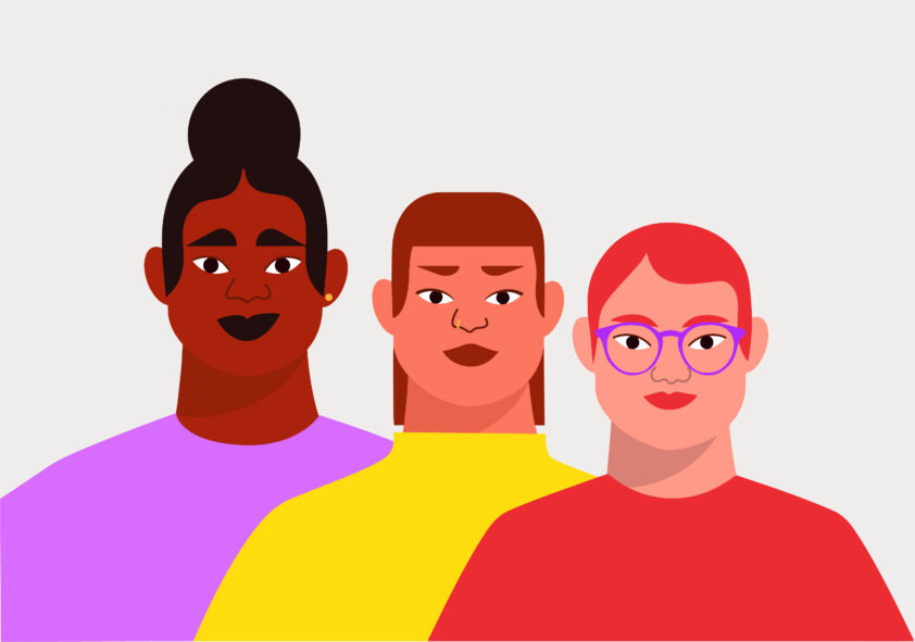
Being conscious and mindful when referencing people in design is essential in becoming more accessible and inclusive, whether that’s through photography, illustration or avatars… Think about the names and styling you give to your subjects/characters, are they inclusive? Google opts for initials as genderless avatars, which works well by adding personalisation but remaining neutral. As well as initials, you could use identicons, animals, smiley faces, brand patterns or photographs of the user – all would be more inclusive over generic human silhouettes.
Facing the future
Gone are the days of purely segregating the market by demographics (gender, age, location, status…), today we have access to hyper-personalised products that are able to cater to customers on a personal level, using data driven from user patterns. Spotify and Netflix are prime examples in showing content derived from consumption habits instead of through gender and the cliches that come with that. I am partial to a cheesy rom-com but that’s not all I want to watch. Many brands have started to look beyond traditional ways to define personas, deeming micro-communities made up of people with shared interests, values and lifestyles, as a more effective method for grouping people together.
Stereotypes within design exist to simplify the market, but they serve as limitations and cause people to conceal the real them. We are humans, we are designed to be complex and different, moulds don’t work, there’s not a one size fits all fast track. People wouldn’t reject the male-female binary if gender stereotypes weren’t so rigid and restrictive. With a growing demand for gender neutral design, marketing brands with a gender neutral lens, will give people the choice in how they want to be seen and heard. And although we can’t completely erase gender stereotypes, we can choose to move away from them and market smarter. And I’m sure in time a new set of rules will be bound to form, as trends come and go, but maybe next time they won’t be so… pink and blue.
Let’s make sure we aren’t perpetuating the stereotypes we aim to defy. We hold the tools as creatives to design a better future, so let’s use them! Next time you design or write something, check in and ask yourself, “Why am I using this colour/word/shape…?” “Does it speak to the brand’s personality or the audience it wants to reach?”, “Has the audience been defined by gender, or could it be more effective to have an audience that’s made up of communities of people with similar interests and aspirations?”
By having these conversations, we begin to unpick gender rules and make room for more creative solutions to design problems. We are creatives after all. Gender is a massive topic and one that is constantly evolving. This is not the end, but the beginning of a gender movement. We are all still learning and developing the best inclusive solutions. It’s a journey and we’re on it together.