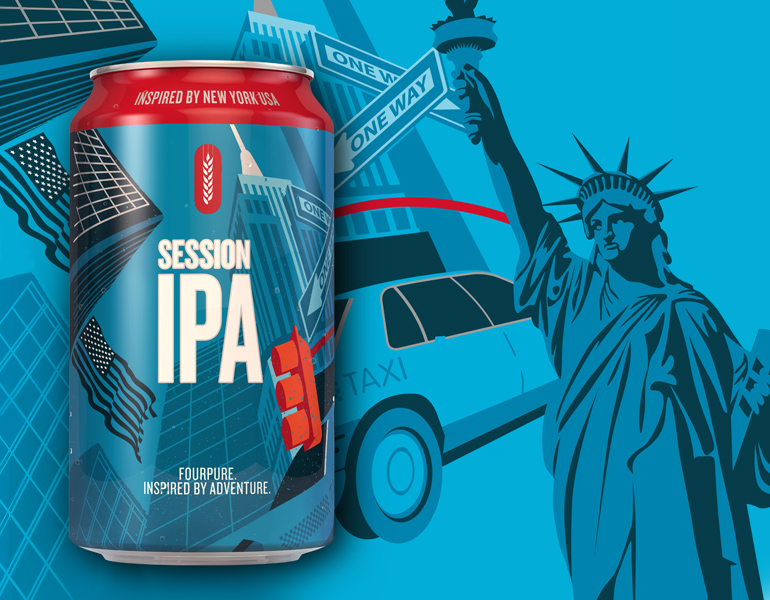
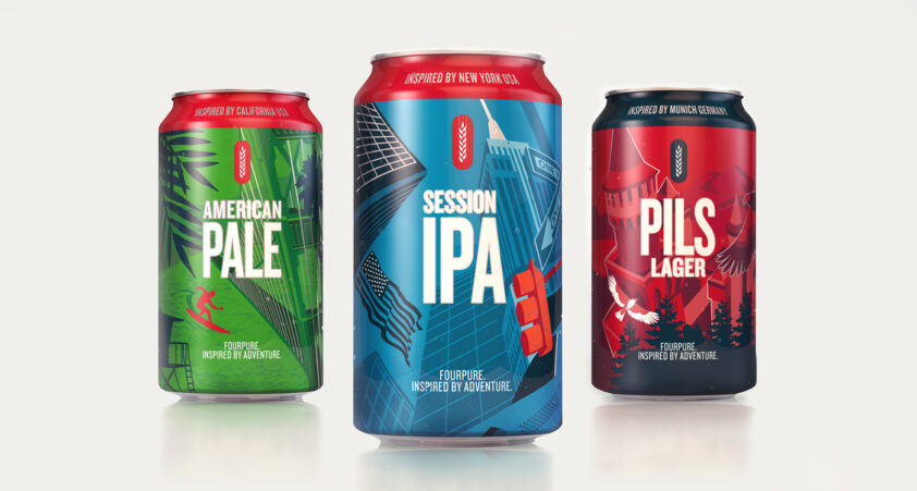
In a category known for brave, illustrative packaging, we had to be bold. With New York, San Francisco and Munich as our inspiration, we created three distinct and vibrant new designs for Fourpure’s core range. For consistency we retained the original colour palette but increased the opacity for a punchier, more arresting result. With Fourpure’s brand awareness at an all time high, we also decided to move the brand’s barley sheaf logo around the can to allow more space on the front for the beautiful illustrations and product name.

Job done – now time to sit back and crack one open!


