Sparkol provides its customers with innovative software and video tools that help create inspiring presentations and storytelling, together with studio services that turn the mundane into the magical. Their globally acclaimed products VideoScribe and Scribely can be used by anyone, anywhere to add flair to presentations.
Mr B & Friends were appointed to deliver a new brand positioning and identity to increase its marketing effectiveness, whilst retaining the well-established product brands as part of its portfolio. The agency delivered this project through its Beta brand acceleration programme, which resulted in a complete rebrand in less than eight weeks.
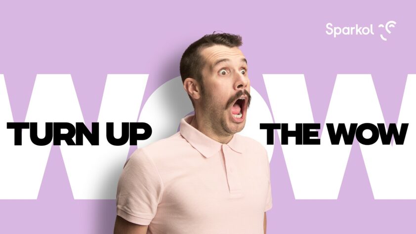
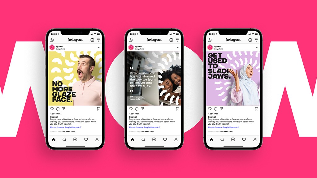
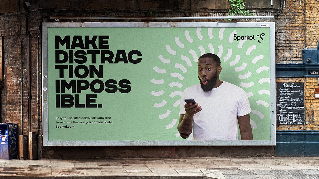
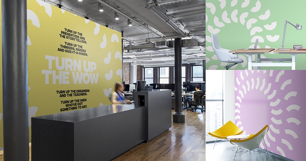
The strategy centres on the new Organising Thought: Turn up the WOW! This idea conveys the product capability, creativity and audience reaction of this fast-growing SaaS and services business.
Senior Designer Nathan Crosby comments, “Our creative vision was to capture the spirit of the Sparkol company and the capability of its products. Expressive imagery alongside a bold type and colour system to make a real impact. The new logo design captures the reaction to Sparkol’s products in a clever graphical way.”
The new brand identity is also designed to drive internal culture at Sparkol – giving an energetic boost to the business and a young and vibrant personality to reflect the people behind the company, the ‘Sparkol-ers’ as they’re known.
Sparkol products are already used in over 160 countries by educators, promoters and communications professionals. The brand refinement further strengthens Sparkol’s position as it targets wider adoption.
Zoe Taylor, Sparkol Owner and CEO, says, “Mr B & Friends helped us to get to the crux of what makes Sparkol special and translated that into a brilliant brand idea, visual identity and tone of voice that really stands out. We exist to help our users achieve surprise, delight and wonder, and the new brand really brings that to life.”
The agency has delivered the new brand strategy, identity, guidelines and key assets during lockdown working virtually with the client. The project was managed by Brand Producer Matt Joy and strategy by Planning Director Adam Partridge.
CEO Simon Barbato, says, “We love the Sparkol story. It’s a story of hard work, innovative thinking and great entrepreneurship. What Sparkol has achieved globally from a modest Bristol base is incredible and we are proud to be able to deliver this platform for their ongoing growth and success.”
View the whole case study here.